Friday, April 23, 2010

I read a lot

I read a lot. In fact, I read a whole lot more than I paint. But sometimes, inspiration from a book creates a theme for a painting. It can just be a few words that set me off. Often, the spark of the idea isn’t visual; the sentence that moves or amuses me is more an idea. I then make the painting, creating associations between the text and the image.

After a really hard day, the main character in Marie Desplechin’s novel “Sans Moi” looks at a bottle of alcohol and announces ‘Well, somebody’s got to finish it” which is wonderfully absurd as she is talking to herself. I made the painting using a pretty, old-fashioned bottle of Lemoncello (a girl drink?), a digestive that only I like and realized that although the painting was a classic still life, I perceived it also as a self-portrait.


In the Ambassadors, the description ‘Unhurried, unflurried, unworried’ is quirky. The main character becomes cooler, calmer and more collected by the influence of Maria Gostrey, and by life in Paris. I also think ‘unflurried’ is made up which makes it even more charming.


I had received a beautiful picture book of Giotto’s work and was looking at his frescos while reading the Henry James novel. I decided to paint a blue ground with some little things going on to animate it, added tiny bits of gold leaf (left over from last month’s frame) and copied Giotto’s version of God’s hand as we can all use a little help.


I read Antonio Tabucchi’s ‘Tristano Muore’ (Tristano Dies) in French. ‘C’est le moment de se saluer’ can be translated as ‘The time to say goodbye’; corresponding to the moment an elephant finds the place he wants to die and traces a circle there. I found that really poignant and wise. I can’t say that I know it’s true but that’s what great about fiction. The book, which talks less about elephants than post-1945 politics in Italy and the country’s failure to live up to the hopes of social renewal raised by the Resistance, is really beautiful.


Other quotes are self sufficient like Shakespeare’s ‘What’s in a name’ with a painting of a rose and Andy Warhol’s “Sometimes people let the same problem make them miserable for years when they could just say, ‘So What?’ (The Philosophy of Andy Warhol) which I wrote on a painting of bananas, obviously inspired from the Velvet’s album.


Dante’s quotes from la Divine Commedy, "the Inferno" are also very beautiful but the process was different as it was part of a decorative painting project. I had prepared about 15 small ornamental paintings, and then chose bits of the poem to compliment them. I didn’t even translate them but wrote on the paintings directly in Italian.
“Ah, quanto a dir qual era è cosa dura “ can be translated as:
Ah me! how hard a thing it is to say


“Tant’ è amara che poco è piú morte” becomes:
So bitter is it, death is little more;


The last example is from « OSS 117 et Force Noire » by Jean Bruce (the writer of the French 007) a completely ridiculous spy novel series written in the 1940’s – 50’s in which a very taciturn character’s only comment about politicians and men in general is summed up greatly as ‘they’re all potatoes” (Tous des Patates). Here is a picture of the unfinished painting .


There’s also an entire blog entrée on Sept 25, 2008 on paintings inspired from ”An Iliad” by Alessandro Baricco, a modern translation of the Homeric poem.

Je lis beaucoup, énormément, même plus que je peins. Mais il m’arrive d’être inspirée par un livre. Quelques mots peuvent me faire partir. L’étincelle de l’idée n’est pas nécessairement visuelle. Je crée une association entre la phrase qui m’émue ou m’amuse et une image.

Après une journée dure, la personnage principale du roman « Sans Moi » de Marie Desplechin regarde une bouteille d’alcool en disant (à elle-même) ‘il fallait que quelqu’un la finisse’ J’ai utilisé comme modèle une forme de bouteille ancienne de Lemoncello (un digestif de fille ?) qu’à la maison je suis la seule à aimer et bien que j’ai fait une nature morte classique, c’est aussi en fait un autoportrait.

Dans « Les Ambassadeurs » de Henri James la description ‘Unhurried, unflurried, unworried’ est bien curieuse, même en anglais. Le personnage Lambert Strether devient plus calme est moins inquiet sous l’influence de Maria Gostrey. En plus on utilise rarement, voire jamais le mot ‘unflurried’ (sans agitation).

J’avais reçu un beau livre des œuvres de Giotto que je feuilletais en lisant James. J’ai peint un fond bleu, j’ai ajouté des bouts de feuille d’or (qui restait du cadre du mois dernier) et j’ai copié la main de Dieu de Giotto car on a tous besoin d’un peu d’aide.

J’ai lu ‘Tristano Meure’ d’Antonio Tabucchi. ‘C’est le moment de se saluer’ correspond au moment où l’éléphant trouve le lieu qu’il a choisi pour mourir et trace un cercle. J’étais très émue par cette idée (quoique je ne sache pas si c’est de la vérité). Le livre, qui parle moins d’éléphants que l’histoire politique d’Italie après guerre et l’incapacité du pays de réaliser les améliorations sociales rêvé par la Résistance est très beau.

D’autres citations sont assez claires comme « What’s in a name ? » car Shakespeare parle ensuite d’une rose, où « Sometimes people let the same problem make them miserable for years when they could just say, ‘So What ?’ » (La Philosophie ‘Andy Warhol’) que j’ai écrit sur un tableau d’une banane, inspiré évidement du disque des Velvets.

Les citations de l’Inferno de Dante sont aussi très belles mais mes intentions étaient différentes. J’avais préparé une quinzaine de peintures d’ornementation et pour les compléter, j’ai choisi des bouts de l’Enfer écrits directement en italien sur les toiles.

« Ah, quanto a dir qual era è cosa dura »
Ah dire ce qu’elle était est chose dure

« Tant’ è amara che poco è piú morte »
Elle est si amère que mort l’est à peine plus

Le dernier exemple vient du livre « OSS 117 et Force Noire » de Jean Bruce. (ça montre que je lis vraiment un peu de tout !) Sur une nature morte de pommes de terres je vais écrire ‘Tous des Patates’, remarque décapant d’un personnage taciturne sur tous les politiciens et hommes de pouvoir qu’il croise.

Voir aussi l’article du septembre 2008 sur « l’Iliade’ de Alessandro Baricco, une traduction moderne de Homer.

Monday, March 29, 2010

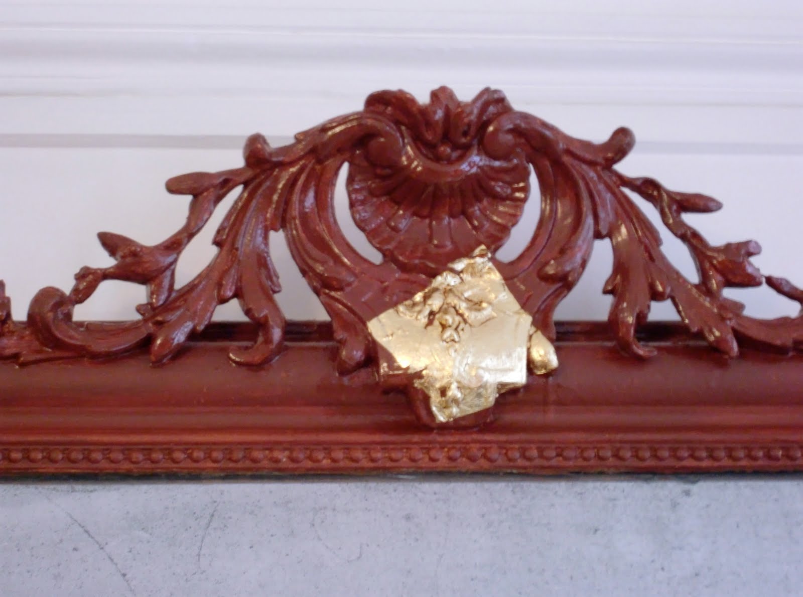
A Gilded Mirror

I got this real gold leaf project and was quite excited about it but also somewhat concerned, as it had been a long time since I had last gilded anything.

Well, I haven’t forgotten how to do it but it did slip my mind how hard it is when the object isn’t horizontal. As this chimney frame was too large to manipulate by myself, it stayed fixed to the wall and I dealt.

I sanded and then painted it with ochre red. I next applied the varnish that the gold leaf sticks to. It took a lot longer than I thought to gild the molding properly, especially the sculpted bits like the more ornamental top part and the little pearls.


I then had to do lots of touch-ups, which was rather a bore but what an improvement! The frame looks lovely in a charming living room in Paris. So much better than a painted white frame on a white wall. What were people thinking about in the 1980’s?


Un projet avec de la feuille d’or! J’étais contente et concernée à la fois car je n’avais pas manipulé de feuille d’or depuis bien longtemps.

Tout s’est bien passé mais j’ai oublié que faire de la dorure à l’horizontal est très difficile et comme le miroir était trop lourd pour moi, il est resté attaché au mur.

Je l’ai poncé, puis j’ai peint une couche d’ocre rouge qu’on appelle ‘assiette’. J’ai ensuite appliqué la mixtion à dorer. Le travail de doreur est très long et laborieux. Surtout les parties sculptées comme le chapiteau et les perles.

Il restait beaucoup de retouches, un travail ennuyeux mais nécessaire. Le cadre fait classe dans ce salon mignon à Paris. Tellement mieux qu’un cadre tout blanc sur un mur blanc. Qu’avaient-ils en tête les gens des années 80 ?(De quoi l’avaient-ils en tête, les gens des années 80 ?)


Tuesday, February 2, 2010

The River


This is a sketch of a sculpture by Aristide Maillol, which I drew at the Foundation Dina Vierny and then finished at home. (I also took some photos to help.) The woman who founded this museum was the artist’s model when she was very young. She worked for Maillol for the last ten years of his life and really became his muse. She posed for all 21 of his monumental sculptures exhibited in the Tuileries (the Louvre gardens). Later, she became an art collector and then founded the Maillol Museum. (She also participated as a Resistant, sneaking people out of France into Spain with Varian Fry during WWII.)

I choose to draw this sculpture because I found it very intriguing. It’s a wonderful pose, beautiful from every angle. Sometimes when you walk around a sculpture, you find that a side or the back is less interesting but this one is great all round. I’ve just learned that it’s called “The River”. (Maillol also did sculptures called “Night”, “Summer”, ‘The Mediterranean’ and ‘Air’. Gosh, a monumental bronze representing air. Don’t you just love allegories!)


Ceci est une esquisse d’une sculpture d’Aristide Maillol que j’ai commencé à la Fondation Dina Vierny puis que j’ai fini sur table. (J’ai aussi pris quelques photos comme support.) La femme qui a fondé ce musée était modèle d’artiste jeune. Elle a travaillé pour Maillol les dix derniers années de sa vie et est virtuellement devenue sa muse. Elle a posé pour les 21 sculptures monumentales exposées aux Tuileries. Plus tard, elle est devenue collectionneuse d’art. (Pendant la Deuxième Guerre Mondiale, elle fait partie du Comité Fry et a fait passer des antifascistes en Espagne.

J’ai trouvé cette sculpture intrigante et j’ai voulu la dessiner. Une pose formidable, belle sur tous les angles. Car en tournant autour d’une sculpture, on trouve souvent un côté pas nécessairement raté, mais moins intéressant que les autres. Je viens d’apprendre qu‘elle s’appelle ‘La Rivière’. (Maillot a aussi fait des sculptures comme ‘Nuit, ‘Eté’, ‘La Méditerranéen’ et ‘Air’. Un bronze monumental qui représente de l’air. Ô que j’aime les allégories !)

Thursday, January 28, 2010

Ceiling beams in a Library


A fire caused by a ghost was the origin of this job. Our client was protecting a chandelier with a sheet and someone turned the light on. The sheet burned hot and long enough to ruin five beams and scorch the painting and the varnish on the other beams and the banister. The firemen came, the house was saved. I don’t really remember what our client thought the dead grandmother was trying to communicate to her but she was desperate to get the room back as it was (but of course, improved). This eight foot ceiling library with a mezzanine is in a four-story house in Paris. We are talking posh.


The entire real wood banister had to be sanded which was truly horrible and tedious. The beams were made in plaster with a fake wood finish. The damaged beams had been replaced. We then repainted all of them with two coats of ochre yellow, the traditional base color before the wood glaze. After all the wood had been sanded to remove the old varnish and all the beams had been prepared, Henri re-varnished the wood and I did the false wood. We choose a light oak finish because the original varnish was rather sinister; too dark and gloomy. (I really like the 19th century but there’s a limit to everything.) I then mixed up my own thick glaze using turpentine, linseed oil and oil paint (raw sienna, burnt sienna and raw umber) to match the varnish. As they’re ceiling beams, I left the drawing of the wood quite simple.


I then did the cabinet under the stairs. I was basically tired of false wood at that point. Back on the scaffolding, we then painted the ceiling bits between the beams an off white color and I varnished all the beams to protect the work.


We were on this job about a month, often on the scaffolding. It wasn’t much fun but I got in good shape!

La cliente pensait que le fantôme de la grand-mère était responsable du feu. Elle m’a expliqué que le drap qui protégé un lustre a pris feu quand ‘quelqu’un’ a mis la lumière. Le feu a brulé assez longtemps pour détruire cinq poutres et abimé la peinture et le vernis des autres poutres. Les pompiers sont arrivés et la maison était sauvée. Je ne me souviens plus comment la cliente a interprétait l’action du fantôme mais elle voulait que la pièce soit comme avant (en mieux). Le plafond dans cette pièce avec mezzanine mesure 4m d’hauteur Cette bibliothèque se trouve dans une maison de quatre étages dans Paris. C’est du lourd !

On a dû poncer toute la rampe d’escalier à la main ; un travail vraiment détestable. Les poutres étaient en staff avec une finition de faux bois. Les poutres abimées étaient remplacées. Nous avons mis deux couches de fond ocre jaune (la couleur traditionnel pour un faux chêne). Puis, nous avons poncé tout le bois à fin d’enlever le vernis qui restait. Henri a revernis tous le bois et moi, j’ai fait le faux bois. Nous avons choisi chêne clair comme coloris car le vernis original était sinistre. (J’aime le dix-neuvième siècle mais il y a une limite à tout.) J’ai ensuite fabriqué un glacis assorti au vernis du bois avec de l’huile de lin, de l’essence de térébenthine et de la peinture à l’huile (terre de sienne naturelle et brulée et aussi terre d’ombre naturelle). Comme je décorais les poutres du plafond, le dessin du bois est resté simple.

Après les poutres, j’ai fait le placard sous l’escalier. A ce moment là, j’étais carrément saturée du faux bois et les odeurs nocifs des produits. Nous sommes ensuite retournés sur l’échafaudage pour peindre les entres poutres et aussi pour vernir toutes les poutres.

On a travaillé un mois sur cette pièce presque toujours sur l’échafaudage. Un travail fatigant, pas très glamour mais j’étais quand même super en forme après tous les étirements.

Tuesday, December 22, 2009

Aviary


This project, which was really pleasant to do, turned out to be quite lovely. The job changed several times. I was first asked to paint a tree with some birds sitting on it and flying around it. We then added butterflies. After that, the tree was abandoned and a birdcage was suggested. The cage was finally dropped also leaving only the birds and butterflies over a light ochre patina.


I got lots of images from the Internet and printed them. I was able to do a sponge patina in less than one day, as the room was small. The following day I worked on one wall, drawing a butterfly on tracing paper, placing it, then transferring it. I basically then filled it in with acrylic paint. I continued with other butterflies, adding them here and there, trying to place them in a balanced but random looking manner. I added a humming bird also.


I came home for the weekend (the job was done in a house in Normandy) and got more images of butterflies as I had already gone through all the pictures I had. The following three days I spent a day per wall painting birds and butterflies. The birds were a lot harder and longer to do. It was great painting butterflies, really colorful but wonderfully calm, soothing work.


The only wish the clients requested when they saw the room finished was to add a ladybug to a branch!

J’ai adoré ce projet qui a bien évolué pour devenir de plus en plus léger et sympathique. D’abord, j’allais peindre un arbre avec des oiseaux autour. Ensuite on a ajouté des papillons. Après la cliente a remplacé l’arbre pour une cage mais la cage a aussi été abandonnée laissant plutôt les papillons en vol et des oiseaux sur une patine d’ocre rose clair.
J’ai fait de la recherche sur internet et j’avais une collection d’images. J’ai appliqué la patine à l’éponge dans la journée. Le lendemain, j’ai travaillé sur un mur. Je dessinais un papillon sur du papier calque, je plaçais le dessin sur le mur et après, je le transférais. Je peignais ensuite le dessin à l’acrylique. J’ai continué cette opération, plaçant des papillons au hasard puis plaçant d’autres pour créer un équilibre. J’ai aussi ajouté un colibri.
Je suis rentrée le weekend. (C’est un chantier en Normandie.) J’ai du trouver d’autres images de papillons car je mettais beaucoup sur les murs. J’ai travaillé un jour sur chaque mur. J’ai bien aimé reproduire les papillons. Les oiseaux étaient plus compliqués mais beau aussi.
Les clients étaient très contents. La seule chose ils voulaient que je rajoute était un petit coccinelle sur une branche !


Friday, December 18, 2009

St. Georges restaurant


We decorated this restaurant in early August. I had come back from vacation late the night before and just got there, rested but not really prepared. Our only wish from the clients was the color chocolate; a difficult choice. The ceiling was shiny yellow; the walls orange and a large beam bright pink (!).The wainscoting and the wood of the pseudo booths desperately needed freshening.

The ceiling was quickly painted white, no questions asked. We then applied the chocolate color to the walls. It was dark but the room was vast. We decided to tint the wood a warm red; a color that would go with the brown of the walls and the bright red leather of the benches. I then needed to find an interesting patina for the walls. It obviously had to be lighter than the base color. I tried lots of different effects and opted for a beige color applied with a dry brush that looked like feathers. It softened the aspect of the dark walls.

The silly columns and decorative molding by the door were decorated in gold paint. We decided to re-do it in silver. I first painted the details in ochre red. I then made a lovely homemade paint using silver powder and varnish and lightly applied it to the spiral columns and the ornaments around the door. It was kind of campy but as it was already there, we had to do something to it and metal patinas are always fun.

Though our decisions seemed haphazard, the final result was rather chic and we were then able to re-do the bar area which I wrote about previously.


Nous avons décoré ce restaurant début août. Je rentrais de vacances la veille. J’étais reposée mais pas vraiment préparée. Les clients parlaient d’une couleur ‘chocolat’, pas évident. Ce qu’ils avaient comme décor était : un plafond jaune brillant, les murs en orange et une poutre rose fuchsia ( !) Les boiseries étaient moches et abîmées.
On a vite peint le plafond blanc mat puis on a applique un coloris chocolat mat sur les murs. C’était sombre mais la pièce est vaste. On a choisi un rouge chaud qui s’est bien marié avec le chocolat des murs et le cuir rouge des bancs. Il fallait trouver une patine ou graphisme pour les murs. Bien sur, plus clair que la couleur de fond. J’ai essayé beaucoup d’effets mais j’ai choisi la couleur beige appliquée avec une brosse sèche. C’était comme des plumes ; ça a adoucie les murs sombres.
Les colonnes (en spirale !) et la moulure de la porte étaient peintes en peinture dorée. Nous les avons refait en peinture d’argent fait maison. J’ai d’abord appliqué de l’ocre rouge à tous ses détails. Après, j’ai refait ses parties en argent, avec une main légère. C’était assez kitch mais amusant.
Bien que les idées de ce décor soient venues à la queue leu leu, le résultat était chic. On a pu ensuite refait le côté bar sur lequel j’ai déjà traité.

Monday, November 30, 2009

St. Georges Bar


The St. Georges bar is a great place outside of Paris in an eastern suburb. A few brothers run it for fun customers. It was just terribly cluttered and desperately needed a make over!

The ceiling was bright yellow (a thick, sponge patina) and the walls were covered with an intense, very aggressive purple. But hey, people came anyway and the regulars were very at home there.

vu du bar avant

They didn’t want to close the bar for too long so we worked over a weekend, the Wednesday November 11th holiday and finished up on the following Thursday night doing the finish on the walls and the silver glaze on the wood. A very tight schedule, indeed.

avant

We started on Saturday morning priming and patching. The brothers and a girl friend wonderfully emptied out the place of knickknacks, posters and bottles! They went away for the weekend, which was good for them as they work long, hard days. Amusingly, many of the regulars stopped by, made themselves (and us) coffee and inspected our work usually finishing with, ‘You’re not going to finish on time’. (Thanks guys for the confidence!)

avant

But we just kept working in a steady manner fixing the walls and covering the yellow ceiling. When our friends stopped by asking us about the choice of palette and expressing worry that we wouldn’t finish, we laughed and said that we hadn’t yet determined the colors and that of course we would finish on time.

The owners had been so happy with our work re-doing the restaurant area of St. Georges in August (more about that soon) that they gave us carte blanche. However total freedom isn’t as easy as one would think, and so on that Saturday morning upon arriving, I again asked one of the brothers if he had any ideas about the decoration and he said, ‘The colors of the Mediterranean’. Oh, that made us happy because it gave us direction.

avant

We also had to keep in mind the previous colors, which were so garish. We couldn’t use a muted, calm palette. It was a noisy, lively bar, not a tea salon. We decided on ochre red, which would go with the chocolate colored walls of the restaurant area. We wanted to create a separate space behind the bar so we juxtaposed two bright blues. The tiles had already been painted so we had no qualms painting them again. We used the delimitation of the tiles to paint stripes.

While decorating the restaurant this summer, we applied a silver patina to the door columns and decorations. (They had previously been painted in gold so we thought it wouldn’t be too over the top to do it in silver!) I had brought silver powder, mixing it with varnish to make a thick glaze. The metal reflects are much brighter, less pastier in homemade paint than in a readymade one. Henry loved it and kept the product in mind for staining the wood in the barroom.

in the works

So we finished the repairs and the priming on Sunday evening. We left the bar half done (hideous) for two days, leaving them to set it up for minimum operation. Wednesday, we applied two coats of ochre rouge on the walls, two coats of each blue behind the bar, and cleaned up the bits that we hadn’t noticed before (yes, that happens, you realize that there’s an entire area usually at knee level that you hadn’t treated with the rest of the repairs). A long difficult day, which resulted in clashing colors and silver stain samples applied haphazardly.. The patina would be done the following evening integrating the red. Apparently certain clients weren’t as confident of the outcome as our dear bartenders when they came for coffee on Thursday morning but that kind of opposition is part of the job.


I arrived on Thursday around 7:30pm, ready to work. It was weird for me to work after dark. But as it’s a bar, you figure that doing the decoration at night is legitimate as it will be seen at night. I started working on the patina, using the same texture as in the restaurant. I had an audience so played it up a bit. A little later the bartender got the clients to leave (not a very easy task) so we had some calm. We worked till after midnight. The decorative finish on the walls was done in record time.


Then we continued the silver glaze, applying it to almost everything. As a translucent stain on the paneling, it radically changed the appearance of the bar, modernizing it without being costly. We covered all the wood, the decorative molding and the columns around the door. I also added thin silver stripes between the blue bands, adding a little glitter behind the bar. The result of was rather magical, very sparkly.

Nous avons ressorti la patine (bien aimée) argentée du restaurant pour teinter le bois. Ce glacis fait maison est beaucoup plus beau que ce qu’on trouve chez un fournisseur.

Nous avons fini les réparations dimanche soir. On a laissé le bar dans cet état (moche) pendant les deux jours ouvrables. Puis nous sommes revenus le mercredi. On a posé les couches de fond (ocre rouge), les bleus derrière le comptoir et aussi les essais de patine argentée. Une journée longue et difficile. La patine sur l’ocre rouge sera effectuée le lendemain. Le rouge sans patine, les bleus sans finition et les échantillons de patine argentée ici et là faisaient n’importe quoi comme ambiance ; les clients s’inquiétaient jeudi matin en arrivant. Heureusement nos clients restaient zen.

Jeudi je suis arrivée vers les 19h30 (drôle d’heure pour commencer la journée de travail). J’ai commencé la patine sur les murs, le même graphisme qu’au côté restaurant. J’avais carrément un public pour me voir appliquer cette patine! Plus tard, ils ont pu virer les clients mais ce n’était pas facile. (Ce bar est vraiment bien aimé, même on plein chantier !) C’était plus calme, on a travaillé jusqu’au minuit. J’avais l’impression de faire de kilomètres de patine en rien de temps.

Le lendemain, on a appliqué le glacis argenté sur tout le bois. Cela faisait beaucoup plus moderne instantanément. On a ajouté de la patine argentée sur les moulures, autour de la porte et même entre les bandes bleues. Le résultat était assez magique et bien étincelant.