Showing posts with label silver or gold leaf. Show all posts

Monday, February 21, 2011

A Silver Frieze


I’ve just decorated a small white water closet. The clients had the tiles changed on the floor so I suggested instead of repainting the room white, I’d use a blue from the tiles on the bottom part of the walls and paint the upper part of the walls and the ceiling gray. Then on the gray, I’d put a silver frieze. We started thinking about decors from the 1930’s. I at first thought I’d do an abstract motif but as the floor is decorated with small blue tiles in a somewhat playful manner, it was hard to find a Modern Art Style geometric design that went with it. Everything I looked at was too strict and not suitable for stencil designs. I came about these roses in a book and really liked them.


I spent a long time drawing them for the stencil then spent a long time cutting it out. Applying the stencil itself was a cinch. I did it in blue. However I then had to repaint the entire frieze by hand in a silver powder mixed with varnish mixture which made it permanent. (I had originally wanted to do the frieze in silver leaf but realized that there would be too many steps involved i.e., doing the blue frieze, filling it in with special varnish for leafing, applying the silver leaf, then re-varnishing the silver as it’s not stable. Way to labor intensive and expensive.)


I used a small brush and covered over the blue with the homemade silver paint. Even though the blue is very bright, the décor is sober (gray on gray) and clean.

Je viens de décorer des toilettes. Les clients ont fait changé le carrelage. Au lieu de le peindre en blanc, je les ai suggéré une fausse cimaise avec du bleu de carrelage en bas et un gris neutre en haut (plafond inclus). L’idée était d’appliquer une frise argentée sur le gris.
Comme thème de frise, les décors des années 30 étaient dans l’air. J’ai débord voulu dessiner un motif abstrait mais comme le carrelage était déjà abstrait mais léger, j’ai eu du mal à trouver un dessin géométrique Art Moderne. Ils étaient tous trop rigide. J’ai craqué pour les roses.
J’ai passé du temps à les dessiner pour le pochoir, puis j’ai passé du temps à les découper. En revanche, l’application du pochoir était d’une rapidité folle. Je l’ai fait en bleu puis j’ai mélangé une peinture maison avec de la poudre d’argent et du vernis. J’ai rappliqué ce mélange à la main sur le bleu. (Au départ, je voulais faire la frise aux feuilles d’argent mais je me suis rendu compte que c’était trop laborieux et onéreux.)
La résultat, gris sur gris est sobre et clean comme mes clients.


Monday, March 29, 2010

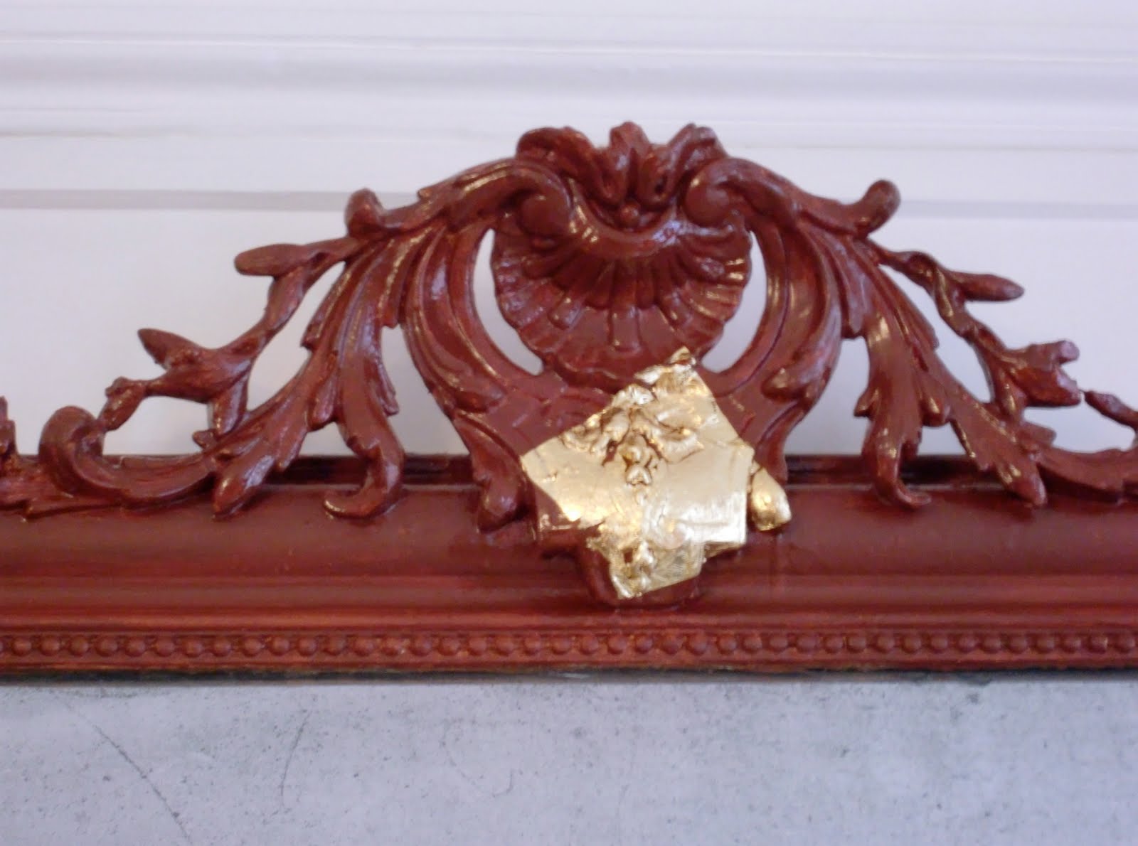
A Gilded Mirror

I got this real gold leaf project and was quite excited about it but also somewhat concerned, as it had been a long time since I had last gilded anything.

Well, I haven’t forgotten how to do it but it did slip my mind how hard it is when the object isn’t horizontal. As this chimney frame was too large to manipulate by myself, it stayed fixed to the wall and I dealt.

I sanded and then painted it with ochre red. I next applied the varnish that the gold leaf sticks to. It took a lot longer than I thought to gild the molding properly, especially the sculpted bits like the more ornamental top part and the little pearls.


I then had to do lots of touch-ups, which was rather a bore but what an improvement! The frame looks lovely in a charming living room in Paris. So much better than a painted white frame on a white wall. What were people thinking about in the 1980’s?


Un projet avec de la feuille d’or! J’étais contente et concernée à la fois car je n’avais pas manipulé de feuille d’or depuis bien longtemps.

Tout s’est bien passé mais j’ai oublié que faire de la dorure à l’horizontal est très difficile et comme le miroir était trop lourd pour moi, il est resté attaché au mur.

Je l’ai poncé, puis j’ai peint une couche d’ocre rouge qu’on appelle ‘assiette’. J’ai ensuite appliqué la mixtion à dorer. Le travail de doreur est très long et laborieux. Surtout les parties sculptées comme le chapiteau et les perles.

Il restait beaucoup de retouches, un travail ennuyeux mais nécessaire. Le cadre fait classe dans ce salon mignon à Paris. Tellement mieux qu’un cadre tout blanc sur un mur blanc. Qu’avaient-ils en tête les gens des années 80 ?(De quoi l’avaient-ils en tête, les gens des années 80 ?)


Friday, December 18, 2009

St. Georges restaurant


We decorated this restaurant in early August. I had come back from vacation late the night before and just got there, rested but not really prepared. Our only wish from the clients was the color chocolate; a difficult choice. The ceiling was shiny yellow; the walls orange and a large beam bright pink (!).The wainscoting and the wood of the pseudo booths desperately needed freshening.

The ceiling was quickly painted white, no questions asked. We then applied the chocolate color to the walls. It was dark but the room was vast. We decided to tint the wood a warm red; a color that would go with the brown of the walls and the bright red leather of the benches. I then needed to find an interesting patina for the walls. It obviously had to be lighter than the base color. I tried lots of different effects and opted for a beige color applied with a dry brush that looked like feathers. It softened the aspect of the dark walls.

The silly columns and decorative molding by the door were decorated in gold paint. We decided to re-do it in silver. I first painted the details in ochre red. I then made a lovely homemade paint using silver powder and varnish and lightly applied it to the spiral columns and the ornaments around the door. It was kind of campy but as it was already there, we had to do something to it and metal patinas are always fun.

Though our decisions seemed haphazard, the final result was rather chic and we were then able to re-do the bar area which I wrote about previously.


Nous avons décoré ce restaurant début août. Je rentrais de vacances la veille. J’étais reposée mais pas vraiment préparée. Les clients parlaient d’une couleur ‘chocolat’, pas évident. Ce qu’ils avaient comme décor était : un plafond jaune brillant, les murs en orange et une poutre rose fuchsia ( !) Les boiseries étaient moches et abîmées.
On a vite peint le plafond blanc mat puis on a applique un coloris chocolat mat sur les murs. C’était sombre mais la pièce est vaste. On a choisi un rouge chaud qui s’est bien marié avec le chocolat des murs et le cuir rouge des bancs. Il fallait trouver une patine ou graphisme pour les murs. Bien sur, plus clair que la couleur de fond. J’ai essayé beaucoup d’effets mais j’ai choisi la couleur beige appliquée avec une brosse sèche. C’était comme des plumes ; ça a adoucie les murs sombres.
Les colonnes (en spirale !) et la moulure de la porte étaient peintes en peinture dorée. Nous les avons refait en peinture d’argent fait maison. J’ai d’abord appliqué de l’ocre rouge à tous ses détails. Après, j’ai refait ses parties en argent, avec une main légère. C’était assez kitch mais amusant.
Bien que les idées de ce décor soient venues à la queue leu leu, le résultat était chic. On a pu ensuite refait le côté bar sur lequel j’ai déjà traité.

Monday, November 30, 2009

St. Georges Bar


The St. Georges bar is a great place outside of Paris in an eastern suburb. A few brothers run it for fun customers. It was just terribly cluttered and desperately needed a make over!

The ceiling was bright yellow (a thick, sponge patina) and the walls were covered with an intense, very aggressive purple. But hey, people came anyway and the regulars were very at home there.

vu du bar avant

They didn’t want to close the bar for too long so we worked over a weekend, the Wednesday November 11th holiday and finished up on the following Thursday night doing the finish on the walls and the silver glaze on the wood. A very tight schedule, indeed.

avant

We started on Saturday morning priming and patching. The brothers and a girl friend wonderfully emptied out the place of knickknacks, posters and bottles! They went away for the weekend, which was good for them as they work long, hard days. Amusingly, many of the regulars stopped by, made themselves (and us) coffee and inspected our work usually finishing with, ‘You’re not going to finish on time’. (Thanks guys for the confidence!)

avant

But we just kept working in a steady manner fixing the walls and covering the yellow ceiling. When our friends stopped by asking us about the choice of palette and expressing worry that we wouldn’t finish, we laughed and said that we hadn’t yet determined the colors and that of course we would finish on time.

The owners had been so happy with our work re-doing the restaurant area of St. Georges in August (more about that soon) that they gave us carte blanche. However total freedom isn’t as easy as one would think, and so on that Saturday morning upon arriving, I again asked one of the brothers if he had any ideas about the decoration and he said, ‘The colors of the Mediterranean’. Oh, that made us happy because it gave us direction.

avant

We also had to keep in mind the previous colors, which were so garish. We couldn’t use a muted, calm palette. It was a noisy, lively bar, not a tea salon. We decided on ochre red, which would go with the chocolate colored walls of the restaurant area. We wanted to create a separate space behind the bar so we juxtaposed two bright blues. The tiles had already been painted so we had no qualms painting them again. We used the delimitation of the tiles to paint stripes.

While decorating the restaurant this summer, we applied a silver patina to the door columns and decorations. (They had previously been painted in gold so we thought it wouldn’t be too over the top to do it in silver!) I had brought silver powder, mixing it with varnish to make a thick glaze. The metal reflects are much brighter, less pastier in homemade paint than in a readymade one. Henry loved it and kept the product in mind for staining the wood in the barroom.

in the works

So we finished the repairs and the priming on Sunday evening. We left the bar half done (hideous) for two days, leaving them to set it up for minimum operation. Wednesday, we applied two coats of ochre rouge on the walls, two coats of each blue behind the bar, and cleaned up the bits that we hadn’t noticed before (yes, that happens, you realize that there’s an entire area usually at knee level that you hadn’t treated with the rest of the repairs). A long difficult day, which resulted in clashing colors and silver stain samples applied haphazardly.. The patina would be done the following evening integrating the red. Apparently certain clients weren’t as confident of the outcome as our dear bartenders when they came for coffee on Thursday morning but that kind of opposition is part of the job.


I arrived on Thursday around 7:30pm, ready to work. It was weird for me to work after dark. But as it’s a bar, you figure that doing the decoration at night is legitimate as it will be seen at night. I started working on the patina, using the same texture as in the restaurant. I had an audience so played it up a bit. A little later the bartender got the clients to leave (not a very easy task) so we had some calm. We worked till after midnight. The decorative finish on the walls was done in record time.


Then we continued the silver glaze, applying it to almost everything. As a translucent stain on the paneling, it radically changed the appearance of the bar, modernizing it without being costly. We covered all the wood, the decorative molding and the columns around the door. I also added thin silver stripes between the blue bands, adding a little glitter behind the bar. The result of was rather magical, very sparkly.

Nous avons ressorti la patine (bien aimée) argentée du restaurant pour teinter le bois. Ce glacis fait maison est beaucoup plus beau que ce qu’on trouve chez un fournisseur.

Nous avons fini les réparations dimanche soir. On a laissé le bar dans cet état (moche) pendant les deux jours ouvrables. Puis nous sommes revenus le mercredi. On a posé les couches de fond (ocre rouge), les bleus derrière le comptoir et aussi les essais de patine argentée. Une journée longue et difficile. La patine sur l’ocre rouge sera effectuée le lendemain. Le rouge sans patine, les bleus sans finition et les échantillons de patine argentée ici et là faisaient n’importe quoi comme ambiance ; les clients s’inquiétaient jeudi matin en arrivant. Heureusement nos clients restaient zen.

Jeudi je suis arrivée vers les 19h30 (drôle d’heure pour commencer la journée de travail). J’ai commencé la patine sur les murs, le même graphisme qu’au côté restaurant. J’avais carrément un public pour me voir appliquer cette patine! Plus tard, ils ont pu virer les clients mais ce n’était pas facile. (Ce bar est vraiment bien aimé, même on plein chantier !) C’était plus calme, on a travaillé jusqu’au minuit. J’avais l’impression de faire de kilomètres de patine en rien de temps.

Le lendemain, on a appliqué le glacis argenté sur tout le bois. Cela faisait beaucoup plus moderne instantanément. On a ajouté de la patine argentée sur les moulures, autour de la porte et même entre les bandes bleues. Le résultat était assez magique et bien étincelant.