Monday, November 30, 2009

Faux-Bois


Somehow, I have just let months fly by. Although I’ve been doing a few interesting jobs, I haven’t been writing about them.

Here’s a very modest water repair job I did with Henri last month in a stairwell. We re-plastered and repainted a few panels (which I did not take pictures of). I also had to do a little bit of false wood. Nothing elaborate; just damaged kick plates. The one tricky part was that, as the false wood plinth decoration continues from one floor to the next, it was difficult to blend the new part I had just painted with the original decoration done many years ago. It’s not perfect but as it’s at ankle level, it will do!

Les mois filent et bien que j’aie de chantiers intéressants, je n’ai pas eu le temps d’en écrire.
Voici une modeste réparation d’un dégât des eaux dans une cage d’escalier. Je l’ai fait le mois dernier avec Henri. Après avoir étalé des enduits et de la peinture, J’ai eu un peu de faux bois à faire, juste quelques plinthes. Une difficulté à maitriser était les transitions entre l’ancien faux bois et le mien. Ce n’est pas parfait mais comme c’est au niveau des chevilles, ça va aller !

Wednesday, September 9, 2009

La Sacra Conversazione


I got myself a skull for my birthday. I ordered it on the Internet from a company called Skulls Unlimited International. (I’m not joking.) It’s a classic skull. I haven’t yet named it but I guess I really should as I’ve already made 6 paintings of it; still lives. But not symbolic still life paintings called ‘vanitas’, which are paintings with skulls and flowers, hourglasses and other imagery representing the ephemeral, meaninglessness of earthly life, which is definitely a tempting theme.


Latin phrases like Memento mori (Remember that you are mortal) and Carpe diem (Seize the day, trusting as little as possible in the future) are really great but I’ll have to save them for future use as my skull paintings include a dinosaur figurine. (I just love them. This one came in an egg and after soaking it in water for about a week, we watched it hatch. Stupid, but fun.)


I keep thinking about representations of ‘la sacra conversazione’, paintings of the Virgin and Saints in which all the figures, set in a single pictorial space, appear to be conversing with one another. I thought that my skull, representing humanity, and a dinosaur, representing prehistoric life, together in the same spatial setting would act as a spoof of that Christian theme of the holy conversation. They are not at all grandiose paintings like a Renaissance Sacra Conversazione. They’re just small still lives with a grand name.


I want them to be sensuous depictions of the subjects so they wouldn’t feel in any sense moralistic. I used a little figurine to depict the dinosaur so that the paintings would be comic and goofy. Maybe I’ll even write ‘la Sacra conversazione’ on them to have them be really absurd.

Je me suis offerte un crâne pour mon anniversaire. Je l’ai trouvé sur l’Internet (chez ‘Skulls Unlimited international’ !) J’en ai déjà fait six natures mortes donc je dois peut-être lui trouver un nom. Mais elles ne sont pas de vraies ‘vanités’. (Genre particulier de la nature morte, les vanités sont des allégories symbolisant la mort. Ces peintures invitent à la réflexion sur l'inutilité des plaisirs, des sens, des richesses... face à la certitude de la mort.) Mais d’ailleurs tentant comme thème.

Les phrases comme Memento mori (Souviens-toi que tu mourras) et Carpe Diem (Cueille le jour sans te soucier du lendemain) m’attire énormément mais ce sera pour une autre fois car mes crânes se trouvent avec des figurines de dinosaures. (Je les adore, celle-là était dans un œuf qu’on a trempé dans de l’eau pendant une semaine. Puis on l’a vu incuber/éclore, nase mais amusant !)

Je pense en ce moment à différentes représentations de ‘la sacra conversazione’, de tableaux de la Vierge et de Saints dont les personnages, dans un espace pictural uni, conversent ensembles. Je pensais au crâne, représentant l’humanité, et le dinosaure, représentant la vie préhistorique, ensemble dans la même espace. Je le voyais comme une parodie du thème chrétien de la sainte conversation. Ce ne sont pas des tableaux grandioses de la période Baroque. Ils ne sont que de petites natures mortes.

Je ne voulais pas transmettre un sens moralisateur. J’ai utilisé une petite figurine d’un dinosaure pour le sens comique. Je pense que je vais même les appeler ‘la Sacra conversazione’ pour que ça soit encore plus absurde.


Tuesday, July 14, 2009

Restoration on a Musical Theme


I’ve been working really hard lately but unfortunately, the jobs are basically house painting with pretty colors, nothing to get ecstatic about. So I was going through some old images and found these. I did this job a long time ago. It’s another decoration ruined by water damage. This domed sky ceiling was in someone’s living room (can you believe it?). There were cracks to repair and bits of sky and drapery to fill in. There were also four corner images with musical instruments. One was severely damaged, so much so that I couldn’t even make out what it was. Fortunately the client took a photo of the image before the mason fixed the plaster.

I worked on a ten-step ladder and as I was two months pregnant, I was exhausted (yes, this was 10 years ago). I have bad memories of the job. I remember having to scramble down the ladder to be sick (I had terrible morning sickness that lasted through the day). I also remember having a hard time getting the colors for the sky right. I used acrylics and weren’t used to them as much as oil paint. I recall finding the perfect color for a bit of sky, then being horrified that the color dried much darker than when wet. I’d apply a touch of paint, go down the ladder and wait a bit to see how it would change. To complicate the job even more, I then found that certain colors darkened when dry and others lightened. I seem to remember that dark colors got darker, light colors got lighter. However, there was always a color that didn’t even follow those rules. And the ten step ladder to go up and down. I was crazy.


The corner painting was easier to restore as I had a photo to copy. I put down some real gold leaf, which is always fun and prestigious. I then sketched in the musical instruments in paint (a sort of under painting) and filled them in. This part of the job I did in artist’s oil paint, which I’m much more comfortable using.


The walls of this music room had lovely molding; very nineteenth century French. We repainted the room off white and then instead of highlighting the molding with house paint, I used artist’s ink (like magic color) and watered it down say 200% (well what I did was put about five or ten drops of ink in a small cup of water). I used a purple-gray color. I painted permanent tinted water to the molding giving it the appearance of watercolor. It was very subtle, very chic, and a lot easier to apply than house paint.

Comme mes chantiers sont plutôt de la peinture de bâtiment en ce moment, J’ai trouvé ses images d’une restauration. J’ai fait ce travail il y a dix ans. Encore une pièce abîmée par un dégât des eaux. Cette coupole se trouve chez une cliente, dans son salon! Il y avait des fissures à réparer puis du rattrapage de drapées et de ciel. Il y avait des encoignures à thème musical dont une était sévèrement endommagée. L’image était presque perdue mais la cliente avait heureusement pris des photos avant la réparation par un staffeur.

J’ai travaillé sur un escabeau de dix marches et comme j’étais enceinte, j’étais épuisée. J’ai de souvenirs assez glauques. Je me souviens d’être obligée de descendre l’escabeau souvent car j’avais mal au cœur. Je me souviens aussi du mal que j’ai eu pour la palette. Je commençais à utiliser les peintures à l’acrylique. Je posais une couleur parfaite pour rattraper le ciel, puis ça séchait trop foncé. Donc j’appliquais des touches d’une couleur, je descendais l’escabeau puis j’attendais voir si la couleur changeait en séchant. Pour compliquer ma tache encore, certaines couleurs séchaient plus claires, d’autres séchaient plus foncées. En général, les couleurs foncées devenaient plus foncées, les couleurs claires éclaircissaient en séchant, puis il y avait des exceptions. L’horreur ! Plus la montée et la descente de l’escabeau sans arrêt, je devenais folle.
C’était plus facile de restaurer l’encoignure car j’avais une photo à copier. J’ai posé de la feuille d’or qui fait toujours classe. J’ai ensuite esquissé les instruments de musique puis je les ai peint avec de la peinture à l’huile. Il n’y avait pas de surprise.

Les boiseries de cette pièce étaient très belles. Après avoir repeint la pièce en blanc j’ai rehaussé les moulures avec de l’encre (coloris gris violacé) diluée qui donnait un aspect aquarellé. Le rendu de cette technique était plus fin qu’avec de la peinture de bâtiment.


Monday, June 8, 2009

A Sky Painting


I got to do it again; a sky mural. This time, it’s to decorate a future child’s bedroom. The clients wanted a blue sky, with few clouds. They’re from the south of France and miss clear blue skies or shall I say, are fed up with the predominant gray of Paris.


Impressionist painting was not the model this time but paintings by Titian! I love it. It wasn’t a complicated painting to do. Even though the palette was simplified to a maximum, the decor's neither boring to look at or was it boring to do as it’s still incredibly pleasant painting clouds. It's almost dreamy. The bonus of this big blue rectangle on the wall was that it surprisingly makes the room more luminous. To fair skies.

J’ai pu faire un ciel du nouveau. C’était pour décorer une chambre d’enfant. Les clients voulaient un ciel bleu avec peu de nuages comme chez eux dans le Midi. Ils ont marre du ciel de Paris.)
Cette fois-ci, le modèle de ciel n’était pas par les Impressionnistes mais plutôt par Titien. J’adore ! Ce n’était pas compliqué à faire et bien que la palette soit simplifiée, le décor n’est pas ennuyeux. C’est même très agréable de peindre des nuages, très rêveur. Ce grand rectangle bleu a même rendu la pièce plus lumineuse !

Tuesday, May 19, 2009

Restoring a Moorish decor


We’d already done some really nice work at the Fédération de la Boucherie (mentioned in ‘sky restoration’). Although this restoration job was done a few years ago, I think it’s worth writing about.

This manor house style building, with its different period pieces, has a storeroom with an extravagant Moorish dome ceiling. Apparently when preparing this room for its new use, a highly decorated wall was covered over by plaster and forgotten for fifty years. One of my colleagues, who young, probably dreamed of being an archaeologist, got permission to tear the plaster wall façade down and restore the original decor. A motivated and ambitious decision as removing a wall makes a mess.


The wall we recuperated was also a disaster. Rods that had been inserted in it to attach the new wall damaged the décor. In some areas plaster had been used to smooth it out, while other parts of the decor had been removed before covering it up. Old wallpaper was too deteriorated to recover and the painting over the fireplace was missing. There were times when this job was so dirty and exhausting that the expression ‘Curiosity killed the cat’ was really meaningful. (There’s this discouraging moment when you almost think that a white wall would be preferable, but no…)


The only factors that save me from despair in this sort of situation are my wonderful co-workers and lots of bad jokes.

So we scraped, brushed and sanded to remove the remaining plaster and old wallpaper. We cleaned the enameled decorative bits. I traced the stencils and primed. I recreated the palette and filled in areas with missing color. I applied the stencils.


Henri replaced molding and carried over and installed a mirror to replace the lost central painting (alas, the clients didn’t want a new painting for over the fireplace but, well it is a storeroom!). I did a false wood finish on the door and stained the inlaid wood red, demanding work done with a fine brush. We worked long and hard but in the end we created a fantastically frivolous décor for which I am grateful.

Cet hôtel particulier, avec un décor thématique par pièce, a une réserve avec une extravagante coupole mauresque. Lorsque cette pièce était préparée pour ce nouvel usage, un mur extrêmement décoré a été couvert de plâtre et oublié pendant cinquante ans. Une de mes collègues, qui a dû rêver d’être archéologue, a eu la permission d’enlever la façade de plâtre pour pouvoir restaurer le décor original. Une décision motivée et ambitieuse car démolir un mur vaut des sacs et des sacs de gravât !

Le mur récupéré était aussi un désastre. On avait inséré de tiges métalliques pour attacher l’autre mur abimant le décor. On avait aussi lissé certains endroits avec du plâtre. D’autres endroits étaient carrément enlevés. Le décor comportait des panneaux de papier peint qui avaient été réduits à la poussière. La peinture au-dessus de la cheminée manquait. Ce chantier était tellement sale et physiquement fatigant qu’on se demandait régulièrement si ce travail valait bien de la peine. C’est dur d’être découragé !

Les seuls facteurs qui me sauvent dans cette situation sont mes formidables coéquipiers, et leurs blagues à deux balles.

Nous avons gratté, brossé et poncé le décor pour pouvoir enlever les résidus de plâtre et d’ancien papier peint. Nous avons nettoyé les parties emailées. J’ai tracé les pochoirs, puis j’ai imprimé tous les bouts à refaire. Henri a remplacé les moulures manquantes. Il a aussi apporté, puis il a installé un miroir sur la cheminée. (Dommage, les clients ne voulaient pas commander une toile originelle, mais, je comprends, la pièce n’était qu’une remise quand même !) J’ai fait un petit faux bois sur la porte, puis j’ai teinté le bois rouge. Un travail exigeant que j’ai fait avec des pinceaux fins. Nous avons travaillé beaucoup sur ce chantier mais à la fin, nous avons créé un décor fantastique et frivole.

Monday, April 20, 2009

Patinas


Patinas are about effects of color, texture and depth; techniques that get away from the flat rolled on color surface that house painting gives you. They can be done with water based or oil based paint, applied partially over a base coat with a sponge, a rag, a brush, or even plastic wrap (although the latter I’ve never tried). Not only a building process of adding layers can create them but also a removal process whereas the top layer becomes transparent by rubbing on chemicals or sanding, allowing the underlying layer to show through. You can start with the lighter color or the darker one. I’ve always thought that patinas should be subtle, creating slight color shifts and movement but unfortunately, because of this idea, my work doesn’t always seem to show up in photos!


I’ve been doing a lot of them in clients’ homes recently. So, even though these photos aren’t brilliant, and other examples look inexistent in my pictures (I won’t even include certain jobs as the images are too depressing), here are some more examples of work.

Les patines sont des effets de couleur, de texture et de profondeur obtenues par des techniques variés qui s’éloignent de la peinture de bâtiment. Elles peuvent être faites à base de peinture à l’eau ou de peinture à l’huile. On les applique sur une peinture de fond avec des éponges, des chiffons où une brosse. Le processus se fait souvent en ajoutant des couches partielles et transparentes mais on peut créer une patine en enlevant la surface de la peinture, en ponçant ou avec des produits chimiques, laissant apparaitre le fond. Ce fond peut être plus clair où plus foncé que les couches suivantes. J’aime les patines subtiles avec de légères variations de tons et de mouvement. Malheureusement, elles sont difficiles à photographier.

J’ai effectué beaucoup de patines récemment. Voici quelques exemples.


Monday, March 16, 2009

A trompe-l’oeil painting

I really wanted to have great photos of this mural painting to show it off but well, here it is: delicate flowers in an assortment of vases on a kitchen wall.


Before doing the trompe-l’oeil painting, I applied a light pink color muted with black on the walls and painted the windows a grayish green.

At first, my client wanted a very sober decor of three planted orchids in the same kind of porcelain flower pot on a long shelf. The project evolved while doing it. The window, as a real architectural element, brought in light and the green of a rosemary bush is visible just on the other side. However, it was also a restriction being so close to my drawn shelf. It limited the size of the flowerpots under it and the space for the orchids ‘to grow’.

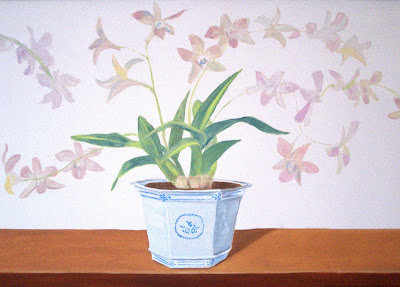


Physical restrictions are always interesting in a project as they push you to adapt. The purism of the same flower, same container theme was abandoned and a more open-minded view of sobriety was adopted. To fill in the wall better, my client decided on varying forms, colors and materials.


Branches of mimosa in a big, ancient-looking stoneware pot and long red and white amaryllis in an elegant transparent vase were added to the orchids in porcelain on each side of the window making the work more challenging and the décor more interesting.


Les photos ne sont pas terrible mais, voilà, un assortiment de fleurs et de cache pots sur une étagère.

Avant de réaliser ce trompe l’œil, j’ai appliqué un rose clair cassé de gris sur tous les murs et pour les boiseries, nous avons choisi un vert gris.

Au départ ma cliente voulait un décor minimaliste d’orchidées répétées trois fois. Mais bien sûr, le projet a évolué. La fenêtre, un ‘vrai’ élément sur le mur, apportait de la lumière et aussi le vert du romarin du dehors mais elle était une contrainte. Les fleurs qui se trouvaient sous la fenêtre ne pouvaient pas être grandes. Elles n’avaient pas l’espace ‘pour grandir’.

Les contraintes inhérentes dans un projet sont toujours intéressantes. Il faut s’adapter. On a gardé les orchidées sous la fenêtre mais ma cliente voulait mieux remplir les côtes avec de grands pots et de fleurs plus abondantes.

J’ai ajouté de pousses de mimosa dans un jarre en terre, et une amaryllis dans une élégante vase en verre, enrichissant le décor de couleurs et de textures.